Based in Toko the design agency Goes is having a blast publishing fancy Ad prototypes on their Tumblr. Quirky ideas that are mostly not viable to produce and will remain the ideas that they are. You can really feel the fun the Goes designers must have had drawing and sketching these ideas out.
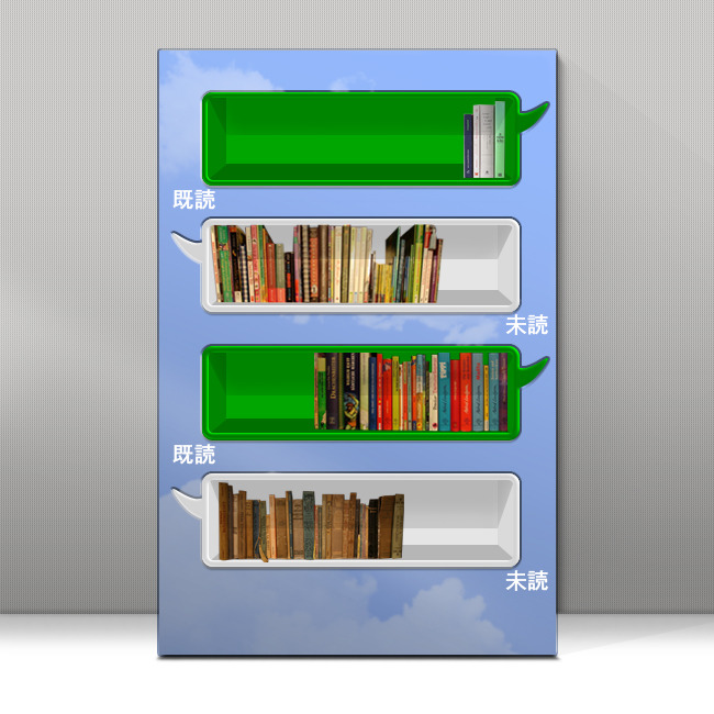
A bookshelf with the infamous Line App as inspiration. The App itself is much more than a mere communication tool in Japan. It’s better desicribed as a mix of whatsapp and facebooks nowadays. Companies are presenting themselves over Line, you can follow them and even buy special stickers to use inside your messages. Apple just took over that sticker & App idea for their own iMessage App (which truthfully is my favorite because of its clean look).

Goes design agency constructed a bookshelf with the Line communication bubbles and is sorting the books into two “read” and “unread” or rather “future reads” sections. I really like the idea behind it. It’s always nice to have a sort of special presentation for your new book possessions and makes things a lot tidier and easy to choose.
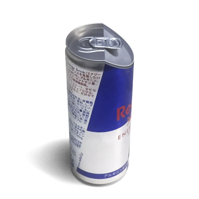
Just take that “simple to open can” which looks so clean and which such a pragmatic approach that you really wish someone would jump the wagon and bring this to market. Red Bull would actually be a great fit and they definitely have the money for a project like this. But with the complex deposit system on cans in the EU, they would need to be deposit-free and probably drag a nightmare of bureaucracy behind them. Regardless, it’s just an assembly of ideas here.

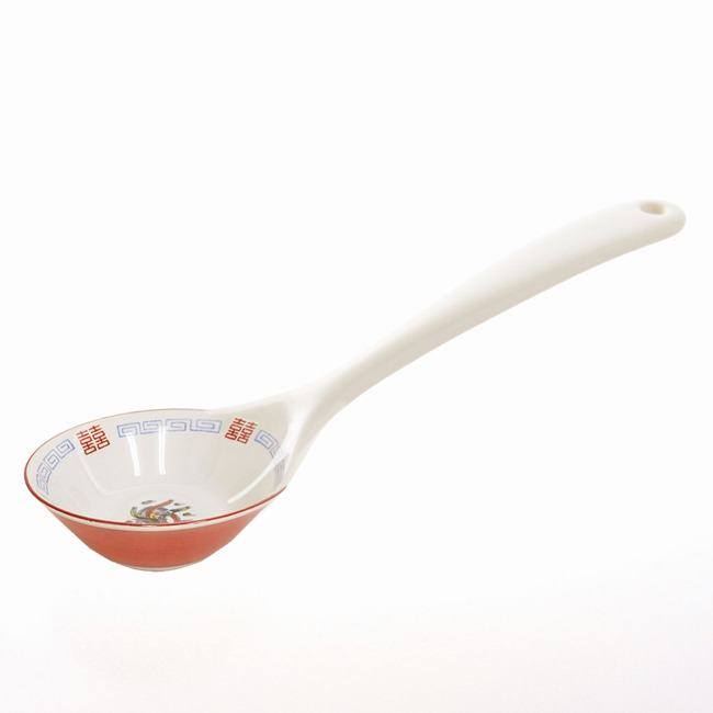
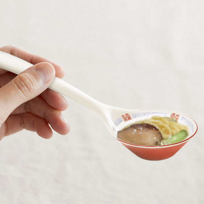
I especially like this little Ramen spoon which I would actually buy in a heartbeat. If you discover something like this, please drop me a link in the comments. They call it the “one bite ramen spoon” and the name says it all.


These are just a few of my favorites so make sure to check out the Goes Tumblr as well. Lots of fun ideas there and if you’re a Tumblr user, make sure to subscribe.
All images © Goes
Post a Comment Blogger Disqus